Bugg by Seachange
This week, Bugg by Seachange, plus the best historical logos added to LogoArchive.
A Bugg’s life
Opinion by Emily Gosling
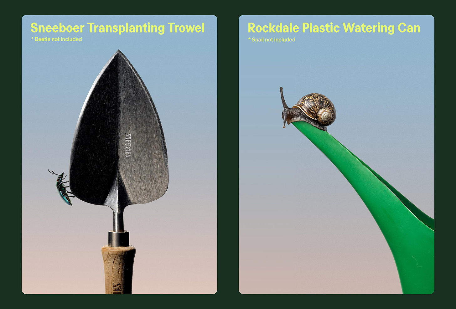
Bugg is a New Zealand-based gardening brand founded earlier this year as the sibling of garden tools and accessories retailer Gubba. It bills itself as “premium products for people who live in the garden,” but its charming brand design definitely goes harder on the latter half of that clause than the former.
Not that it looks cheap by any means — far from it — but such is the skill of the studio behind it, Seachange, that it shows that ‘premium’ and ‘cute’ need not be mutually exclusive.
Auckland-based Seachange (TWELV., Food Nation, TWYG) worked across the naming, strategy, visual identity, packaging design and more for Bugg, seemingly with an overwhelming focus on taking gardening brands out of the dirt and into far more joyful, playful territory.
Instead of lurking in the shed, this is a gardening label that emerges bright-eyed and lightly eccentric: part high-design lifestyle brand, part imagined ecosystem of garden-dwelling characters, and entirely committed to delighting the design-conscious consumer.
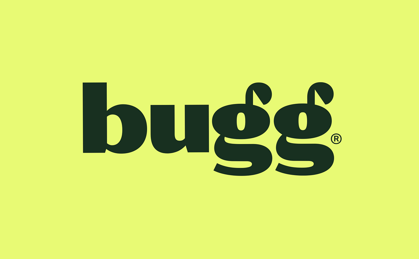
At the core is the name itself. ‘Bugg’, a gently irreverent nod to both insects and the low-level mania that grips hobbyists across the board, comes alive typographically. The logotype turns the double ‘g’ into the star of the show: the mirrored bowls feel simultaneously like sprouting plants and a beetle’s antennae. This smart, small but hardworking typographic gesture makes for a succinct but personality-packed wordmark that’s expressive but just the right side of cartoonish, fun but still refined.
Alongside the wordmark, the primary brand typeface is Perfektta by Czech Republic-based foundry Displaay. Described by the foundry as “a sans-serif typeface family with narrow proportions and a clearly visible contrast in the stems”, Perfektta’s clean, contemporary geometry brings a crispness that offsets the more characterful illustration and photography.
The colour palette takes its cues from the garden but avoids the expected greens-on-greens. Earthy, mineral-driven tones that recall things like moss, clay, compost, and bark form the main palette, punctuated by vibrant acid pops of brightness that run through accents, labels, trims, and digital UI moments.
There’s an editorial feel to much of the identity, which uses a series of fashion-like photographic portraits that eschew the usual category conventions for the garden.
→ Continue Reading
Discover over 5000 logos from history, the largest archive of its kind online.
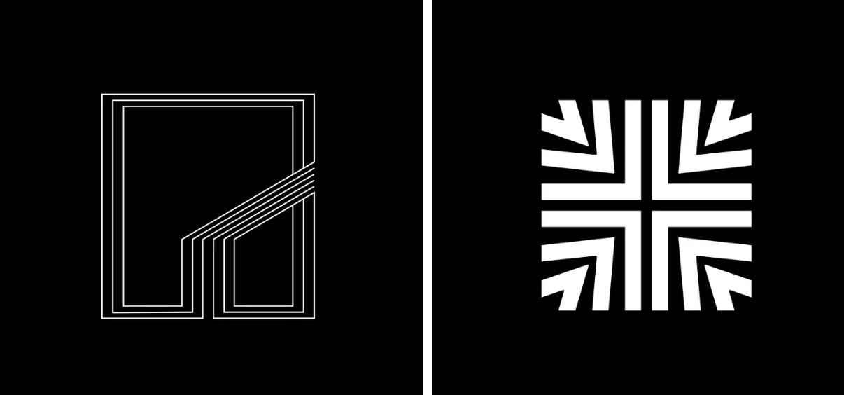
LogoArchive is the world’s largest online historical logo book with 5000+ examples, with more added every day for endless inspiration. Above, some of the recent logos added to the archive.
→ Join LogoArchive
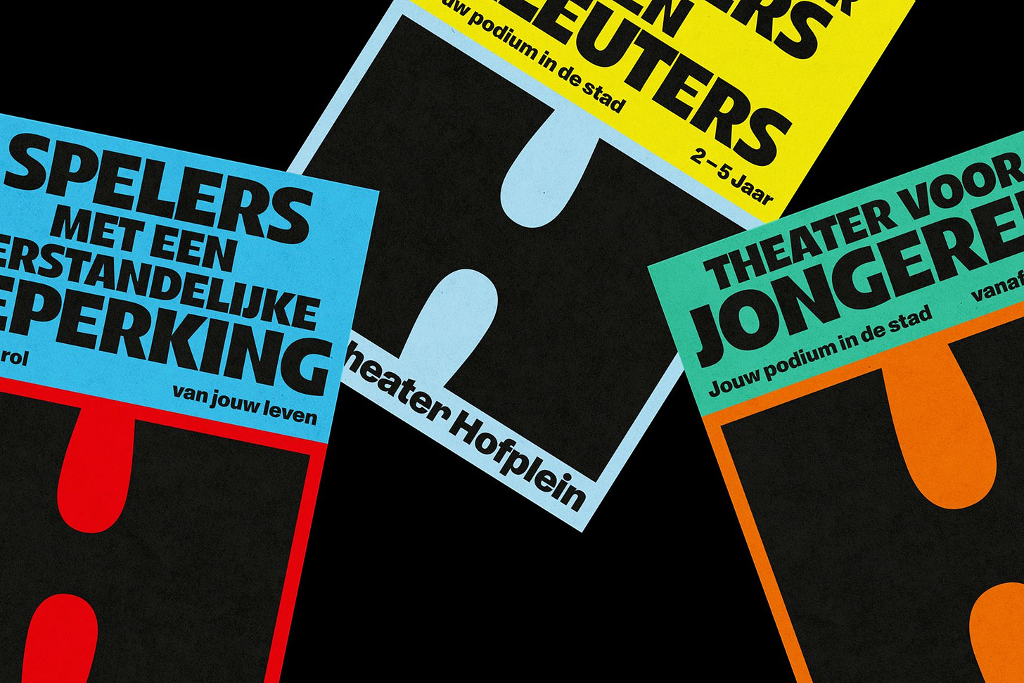
Brand Archive: Jeugdtheater Hofplein
Be inspired by the industry’s latest and best. Brand Archive has the logos, colours, typefaces and applications from some of the world’s best brands. It’s a resource like no other.
→ Visit Brand Archive
International type set
Opinion by Emily Gosling
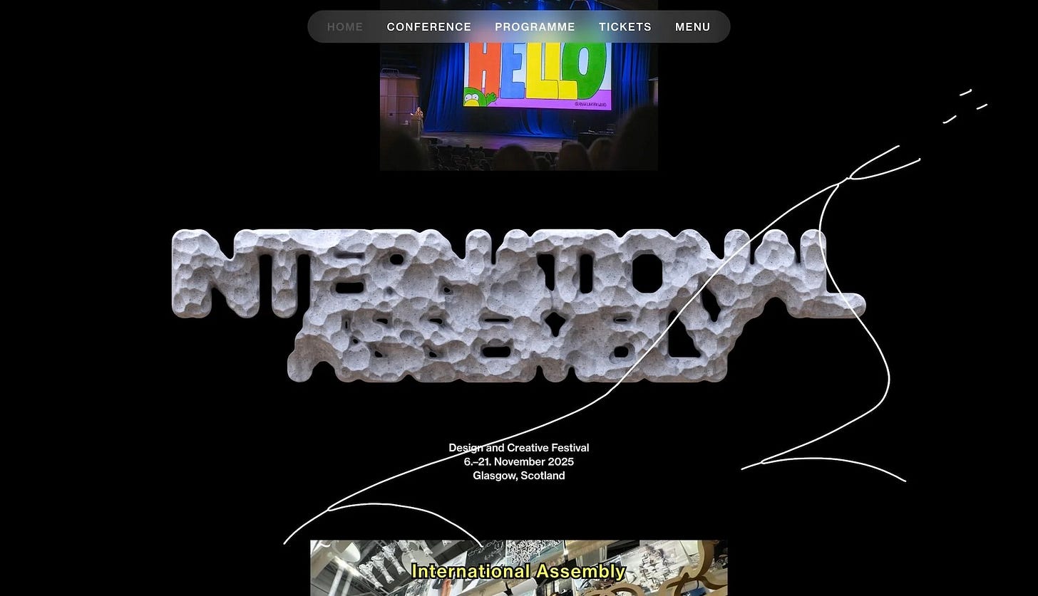
International Assembly began life as Graphic Design Festival Scotland back in 2014, founded by then-recent-ish grads Beth Wilson, James Gilchrist. The pair also helm Warriors Studio, which has been taking care of the festival’s creative direction, branding and design since its inaugural edition, too.
GDFS became International Assembly, or INTL, in 2020; and when the new name and identity, also by Warriors, launched, the studio said it envisaged this to be an ongoing collaboration with different creative practitioners such as designers, artists, writers and those working in other disciplines as time went on. Indeed, GDFS’s identity famously changed with each year’s event, a tradition that it seems has been continued to a point with INTL.
This year’s identity is especially striking, and was created by Warriors in collaboration with NAM, a design studio based in Stuttgart and Barcelona helmed by Nam Huynh and Mark Bohle.
Warriors and NAM are no strangers to one another: they first worked together over a decade ago when Bohle’s posters were shown in an early edition of GDFS. Since then, the partnership has taken in shared exhibitions, workshops, and experiments across print, digital and spatial media. It’s a relationship that’s grown alongside the festival itself, and that familiarity becomes the starting point for the deliciously expansive visual world of the INTL 2025 identity.
Rather than anchoring the identity in a single aesthetic device, NAM and Warriors draw from the spirit of the festival as a lived experience: the unpredictable encounters, the sense of community, the celebratory charge that runs through its talks, workshops and exhibitions.
→ Continue Reading
Quick links:
Thank you for subscribing to Logo Histories. If you enjoy reading this short you may also enjoy these resources from the same team:
New! Portal – Design-driven jobs board, post a job for free.
Brand Archive – Research tool for brand designers.
LogoArchive Website – Searchable modernist logo archive & research tool.
LogoArchive Shop – Vintage design books & LogoArchive Zines.
BP&O – Contemporary design editorial.


