
Gloopy and bubbly
This week, Bond's gloopy, bubbly, occasionally borderline illegible identity for LAB, and a timeless, vernacular approach to relaunching legendary Italian eatery Caffè Nazionale by Studio Mut.


Gloopy, bubbly, borderline illegible
Opinion by Emily Gosling
It’s always confusing, surprising and slightly disappointing when you come across art or design-focused brands, agencies, platforms, publications or organisations that seem to have a total disregard for what they look like – as though their own central premise and raison d’etre is at odds with their look and feel. I won’t name names, because that feels both mean and unnecessary, but I have no doubt that if you’re reading this, a few examples will spring to mind.
One organisation that absolutely does not have this problem is LAB Institute of Design and Fine Arts, thanks to some excellent new brand design work by Bond (Norrin, Siuru, Veikkausliiga), which started out with its Helsinki office and now has teams across Dubai, New York, and San Francisco.
Known as LAB Muotoiluinstituutti in Finnish, LAB Institute of Design and Fine Arts is part of LAB University of Applied Sciences based in Lahti, and is the largest BA level design educator in Finland, offering a wide variety of programmes in the fields of design, fine arts and visual communication.

Bond worked across LAB Institute of Design and Fine Arts’ new brand strategy, storytelling, logo design and motion design, aiming to strengthen the institute’s position “in an increasingly competitive higher-education landscape”, says Bond, as well as looking to “clarify its role within the larger LAB organisation, and reignite its appeal among future designers, artists and creative professionals – both in Finland and internationally.”
What’s so powerful about the new branding is that it feels genuinely daring and different: many a higher education organisation would surely find that gloopy, bubbly, occasionally borderline illegible central wordmark far too out-there. But this is an art and design institution: if it’s teaching its students to take risks, and think differently, then that’s reflected succinctly in the visual identity that it puts out into the world.
According to Bond, the identity needed to embody LAB Institute of Design and Fine Arts’ “core philosophy: to reform, rethink, and reshape”. The agency continues, “The strategic shift was to move from describing education to defining transformation. Instead of presenting the Institute as a place to study design, we positioned it as a launchpad for a new kind of creative professional – individuals who actively reshape their field, their surroundings and themselves…
→ Continue Reading


Simple yet distinctive, at LogoArchive discover how basic forms became unique symbols.
LogoArchive is the world’s largest online historical logo book with over 5000 examples, neatly categorised, and including heart logos.
→ Join LogoArchive

Brand Archive: Nice
Be inspired by the industry’s latest and best. Brand Archive has the logos, colours, typefaces and applications from some of the world’s best brands. It’s a resource like no other.
→ Visit Brand Archive


From the streets
Opinion by Emily Gosling
Caffè Nazionale is a historic bar on Piazza Libertà in Arzignano, a small city in Veneto, Italy, which was the social heart of the town – a place for conversation, card games, billiards, and the daily ritual of an espresso at the bar – for generations, before falling into closure and decline.
Having first opened in the 1950s, the Caffè closed in around 2018 but in May 2022, the local administration launched a revitalisation project with the goal of preserving the Caffè’s historical character.

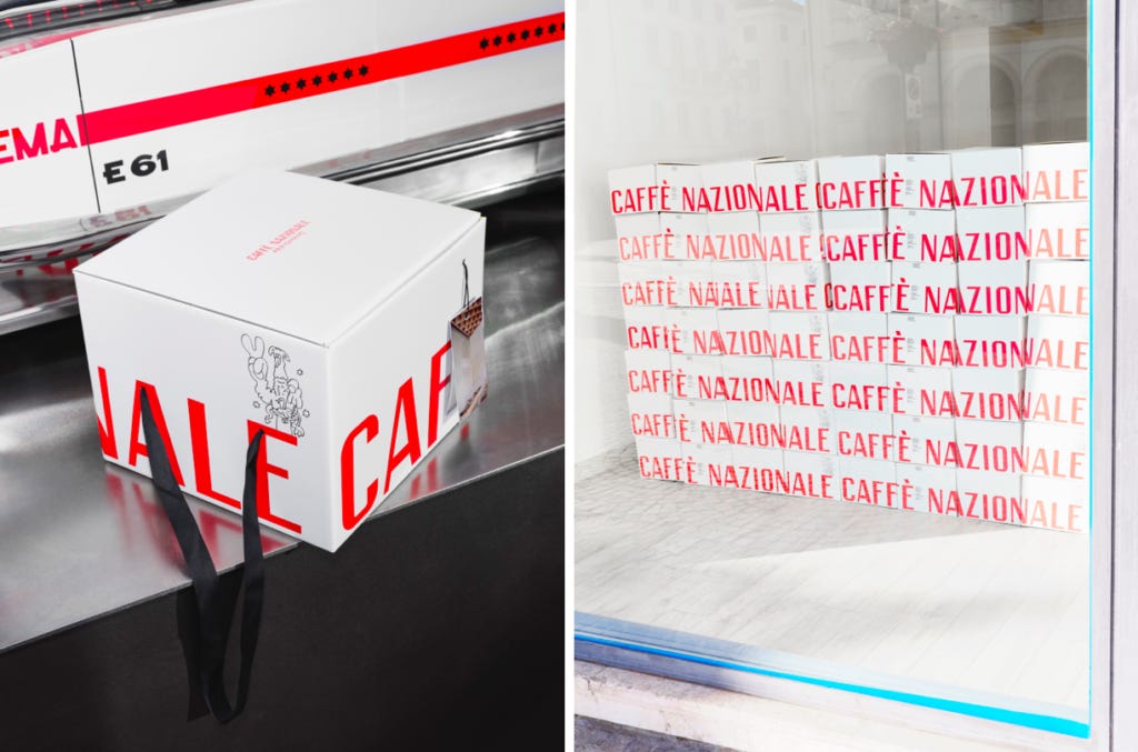
Bolzano-based Studio Mut (Inside Lottozero, Inn Situ, Innsbruck International) was approached with a pretty open brief to create this absolutely charming brand identity, which so beautifully expresses the idea at the heart of Caffè Nazionale’s reopening – an act of “restitution, giving the café back to the people it belongs to,” as Studio Mut founder Martin Kerschbaumer.
Now open seven days a week from 7am until midnight, with a coffee at the bar costing just one euro, that idea of being absolutely for the people is ingrained across absolutely everything – and captured in the copyline or “motto”, as its creator Studio Mut puts it, that underpins the new look and feel: “Se magna, se beve, se sta ben,” which translates as “You eat, you drink, you have a good life”.
The typographic foundation of the identity is drawn directly from the Italian streets around the dazzlingly beautiful 19th century piazza on which Caffè Nazionale is sited: references include panini vans, parking signs, salumerie food store fronts, barbershops, laundries, pizzerias, and car repair workshops – it’s all about that vernacular approach to ensure Caffè Nazionale’s identity feels not like the launch of a snazzy new Instagrammable brand/‘destination’, but something that’s always been part of the fabric….
→ Continue Reading
Quick links:
Thank you for subscribing to Logo Histories. If you enjoy reading this short you may also enjoy these resources from the same team:
New! Portal – Design-driven jobs board
Brand Archive – Research tool for brand designers.
LogoArchive Website – Searchable modernist logo archive & research tool.
LogoArchive Shop – Vintage design books & LogoArchive Zines.
BP&O – Contemporary design editorial.