For a loop
Opinion by Emily Gosling
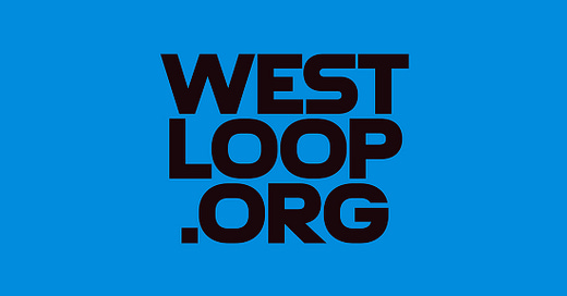
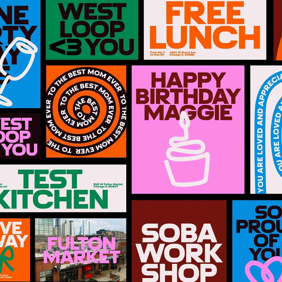
The official blurb that surrounds Chicago’s West Loop area is that it’s the city’s ‘hottest neighbourhood… a foodie mecca’, according to Choose Chicago, a ‘cultural powerhouse’, in the words of Landor, which recently created its new brand identity.
Having never been to West Loop, or even Chicago, it’s hard to get a grasp of what this all really means. Such enthused descriptors often require a bit of reading between the lines. It makes me think about Leyton in east London, where I live – a place often optimistically described as ‘up and coming’ (which in fairness, a few tiny pockets – namely a small stretch of road near the overground and the nerve centre of priced-out-of-Walthamstow-yummy-mummydom, Francis Road – are); but which for the most part is still a place where it’s depressingly unsurprising when someone sets fire to your front door.
So to discover the real West Loop, I looked to the trustiest of research tools: Reddit. The consensus seems to be that it’s a pricey-ish part of town that attracts a lot of restaurants since the milieu is generally ‘corporate’. As one Redditor writes, ‘the West Loop gives people that trendy hype feel weather [sic] they’re temp residents till they have kids, big time earners, your clients from out of town, or some suburbanites trying to live it up. It’ll probably calm down one day and there will be a new hip neighbourhood’. So in short, a classic case of gentrification; but one that seems largely inoffensive and foodie-focused.
This all chimes with what Landor says: ‘West Loop’s identity is changing, fast. And everyone sees it a little differently.’ Therefore – as is probably the case with pretty much all place brands – it’s almost impossible to create something that pleases all the people, all the time.
→ Continue Reading
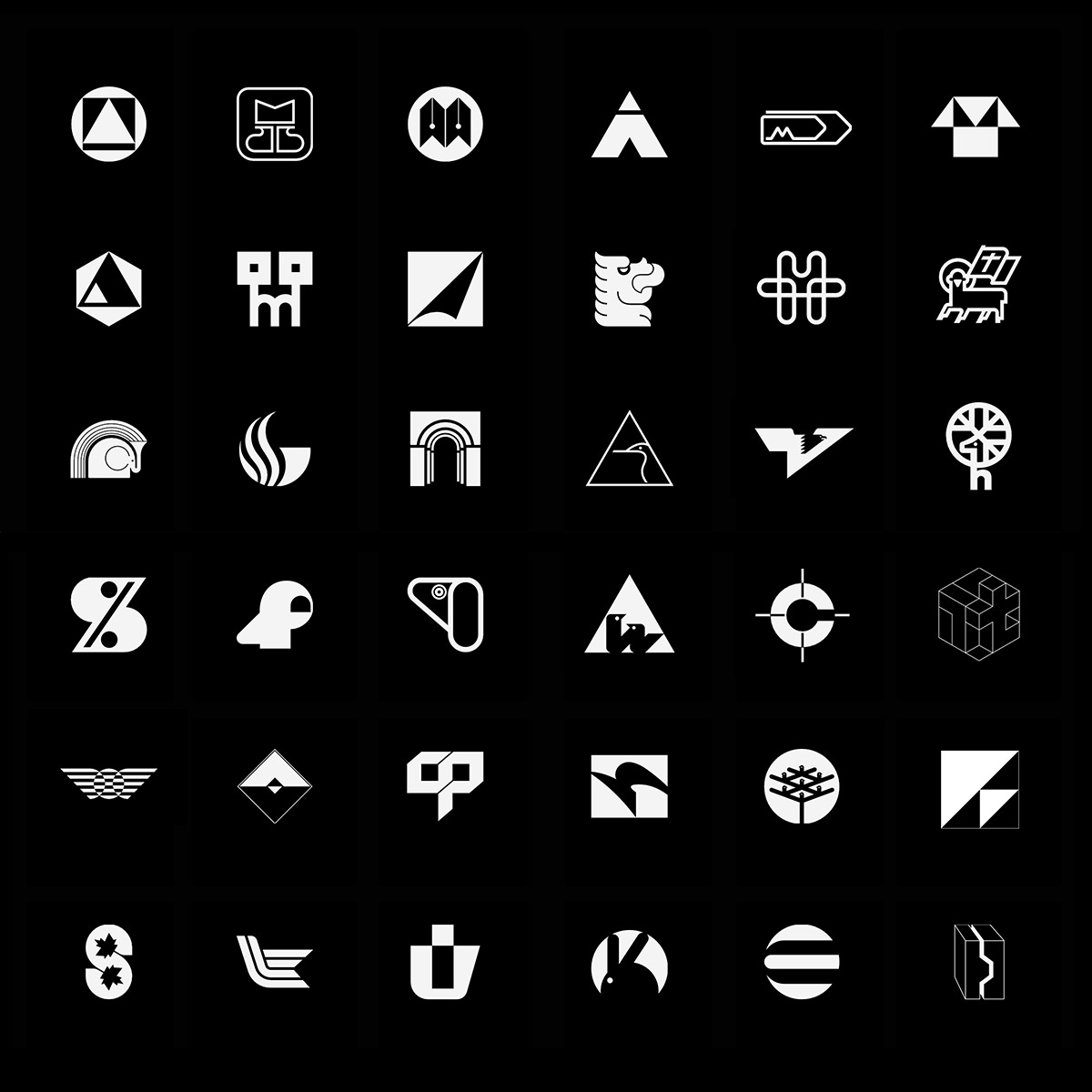
The largest historical logo book online • Updated daily, endless logo inspiration
Discover the world’s largest online historical logo library, rebuilt for 2024. Find over 4000 logos (more added everyday), bookmark and collate, and learn from history’s greatest.
→ Join LogoArchive
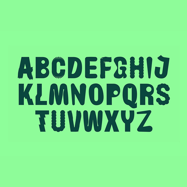
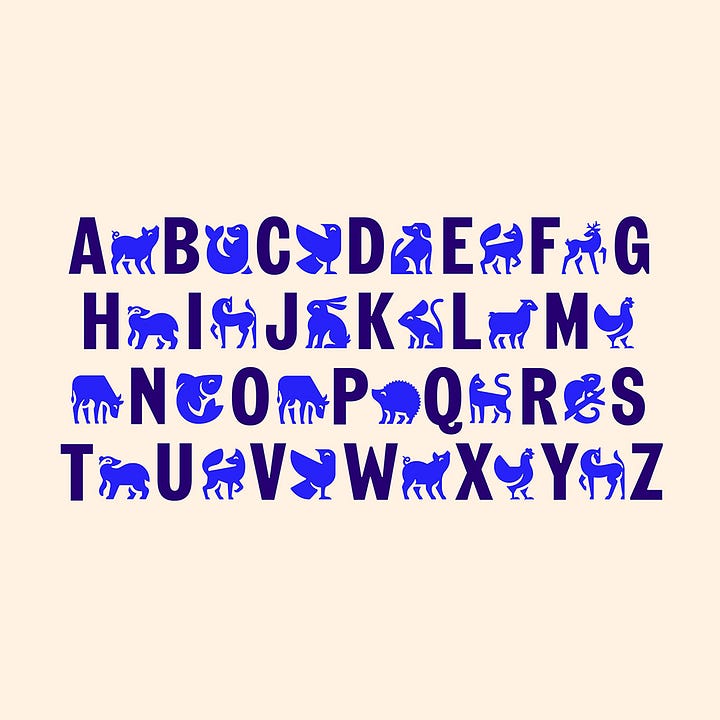
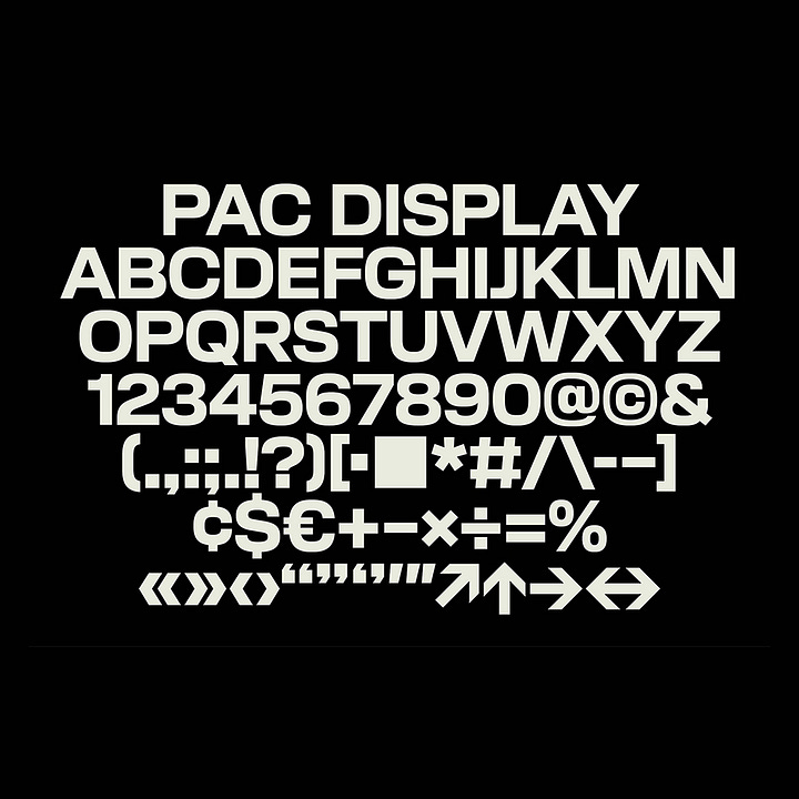
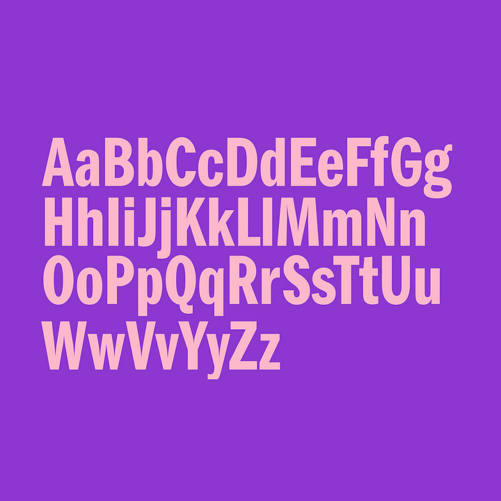
Collections: Typefaces
A collection of custom typefaces designed as part of a broader brand identity design project reviewed and featured on BP&O. This collection is an ongoing project and is added too as new reviews are added to the site. Also discover our collections of logotypes and colour palettes.
→ Discover more
Build better brands.
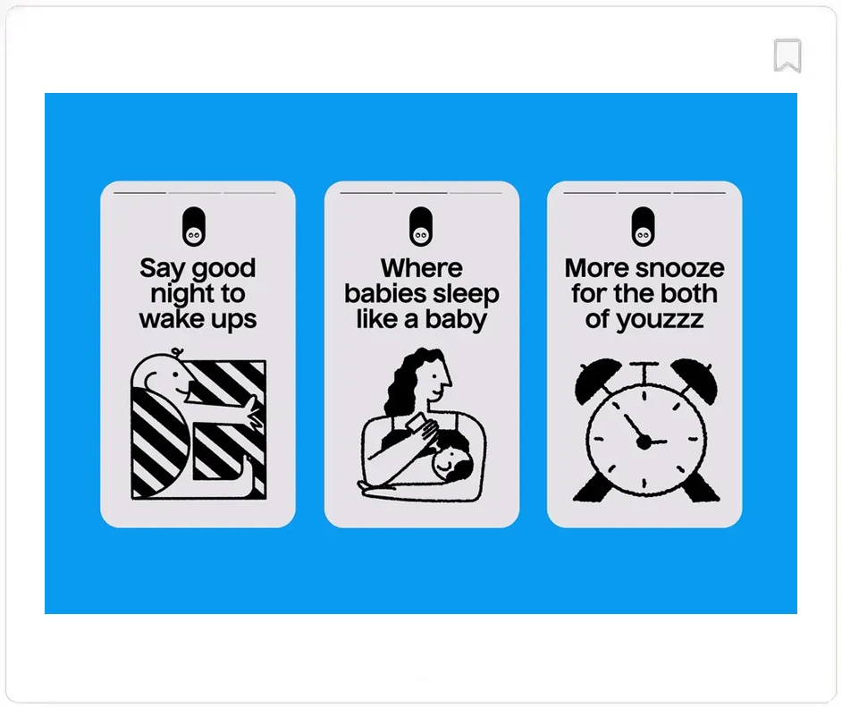
Be inspired by the industry’s best. Brand Archive has the logos, colours, typefaces and applications drawn from some of the world’s best brands. A resource like no other. New additions include Sleep Origin by Allgooday and Stellar Artois by JKR Studio.
→ Visit Brand Archive
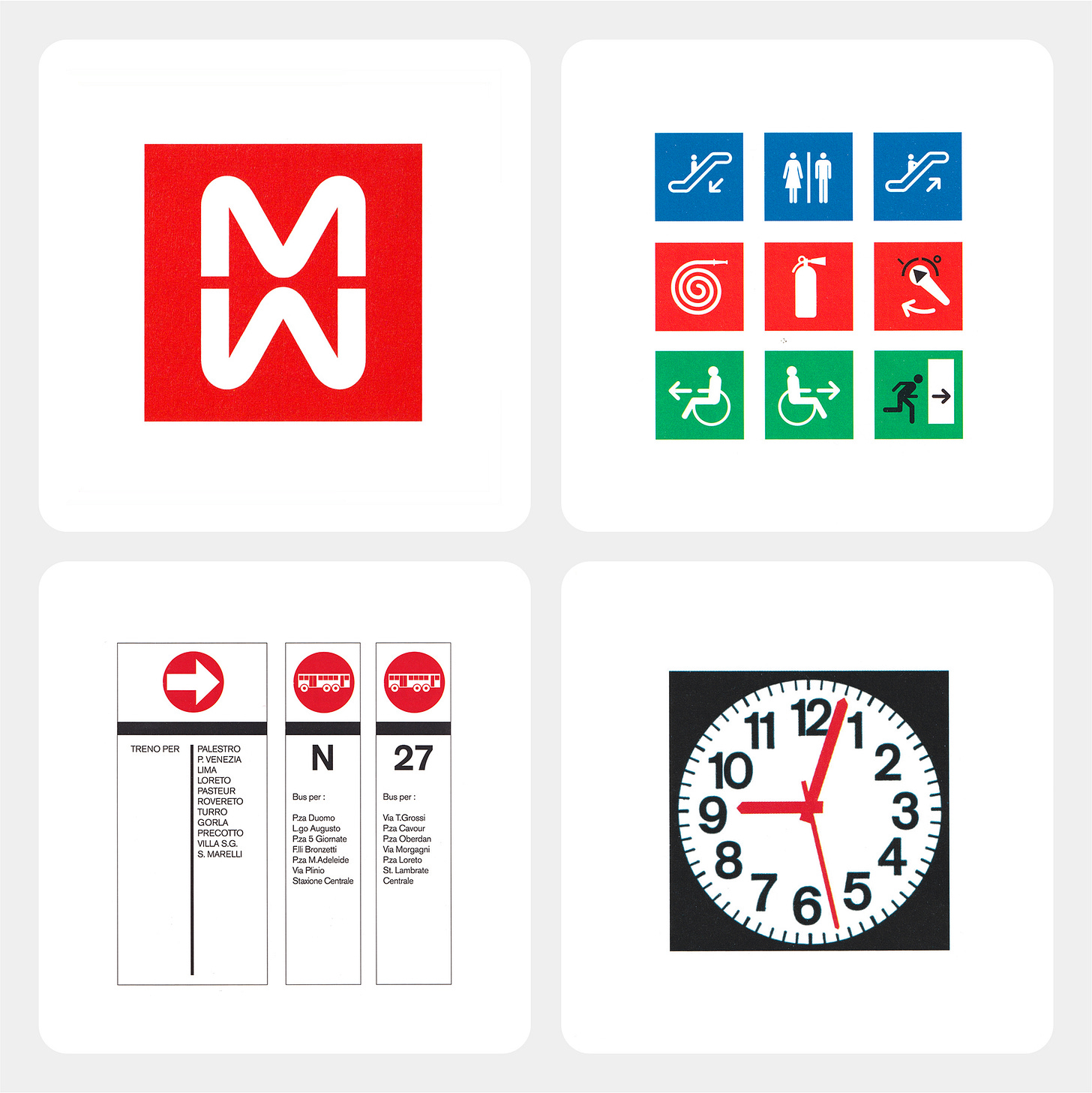
Milan Metro – Logo Histories
Discover the fascinating story of Bob Noorda's 1962 unused symbol for Milan Metro.. Told by the internet’s largest archive of logo histories.
→ Read
Thank you for subscribing to the BP&O Newsletter. If you’re interested in other design-related resources and tools, also check out these from the same team:
Brand Archive – Research tool for brand designers.
LogoArchive Website – Searchable modernist logo archive & research tool.
Logo Histories – Stories behind great historical logos.
LogoArchive Shop – Vintage design books & LogoArchive Zines.

