Rain or shine
Reviewed by Emily Gosling
There’s always something intriguing about niche, singular companies, stores and brands. When I was growing up, I distinctly remember a shop that sold only various things made out of wicker, for instance. It both intrigued and baffled me then, before I understood the concept of a ‘front’, a la (or so rumour has it) the numerous shops that once lined Hackney Road selling unfeasibly garish shoes and handbags displayed in their polythene wraps.
But where brands are niche – and not thinly veiled money laundering schemes – they’re rarely not absolutely charming. Serres Toundra, or just Toundra for short, is no exception; specialising in nothing but cucumbers and now bearing some gorgeous new branding thanks to LG2, a creative studio with outposts in Toronto, Montreal and Quebec City…
→ Continue Reading
Pachama
How&How, 2024
Pachama uses the power of satellite images and LiDAR technology to generate accurate readings on real-time carbon removal. By connecting nature, technology and community Pachama can accurately report on where carbon credits are being used and what is being done to enhance sequestration efforts. This symbiosis of nature, technology and community is at the heart of the organisation’s new visual identity devised by How&How and manifest in a new logo. Formal geometry of circles and hexagonal, creating a flower and leaf-like form, and venn diagram-like intersections captures the spirit of Pachama’s efforts in a simple and distinctive form.
→ Discover more logos
Liquid Architecture
Reviewed by Thomas Barnett
In the words of synesthete Johann Wolfgang von Goethe, ‘music is liquid architecture; architecture is frozen music’. Unlike 19th-century architecture, contemporary graphic design is afforded no such static reprieve – it faces the challenge of animating the ‘universal language’. Whereas once the plastic arts could content themselves with merely freezing music, any contemporary attempt to visually translate music must now aim for warm, beating, liquid life.
The question of how to capture sound in visual form is an endlessly thrilling brief for designers. So it is with considerable envy, as well as admiration, that I examine Landor & Fitch’s recent brand identity for the Milano Orchestra Sinfonica.
All orchestra brand identities must live or die in the shadow of Studio Dumbar’s collaboration with Amsterdam Sinfonietta, a formidably impressive project that began in 2006 but reached its peak in 2018 with the launch of a new identity. Studio Dumbar generated some of the most truly beautiful poster designs of the century so far (for which it was rightfully awarded a D&AD yellow pencil in 2014)…
→ Continue Reading
Now on Brand Archive:
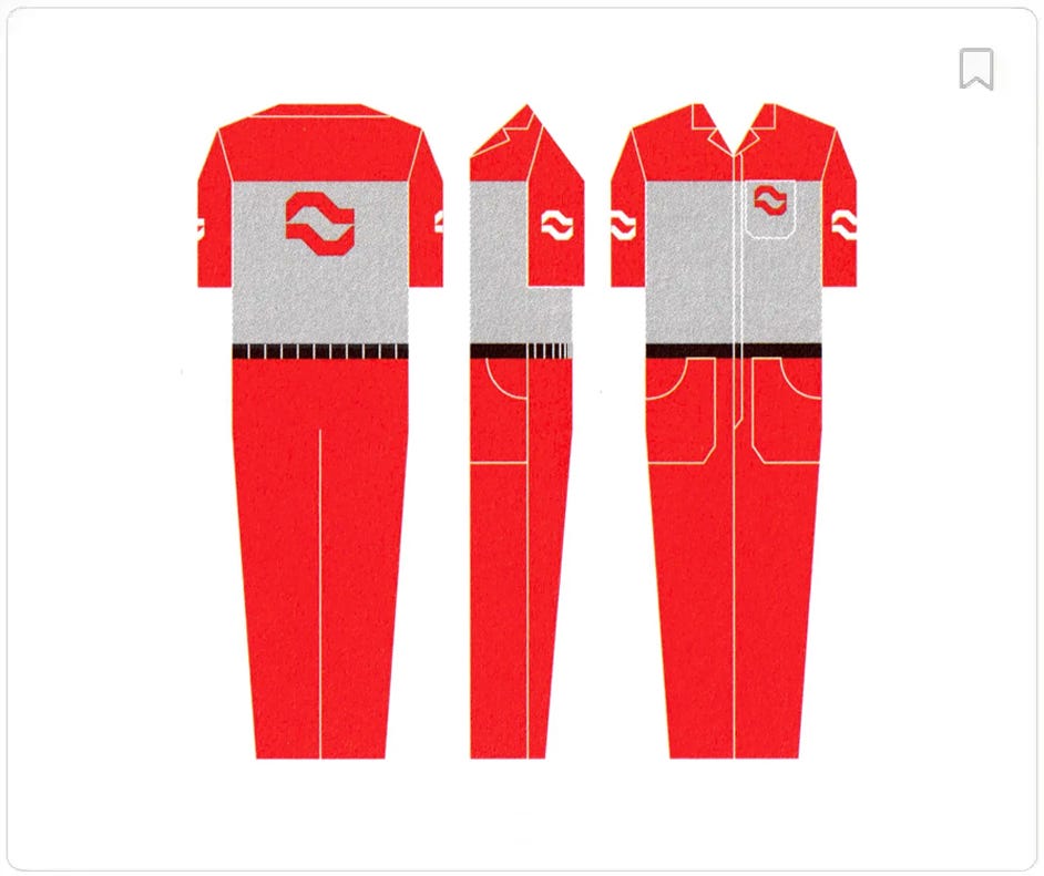
São Paulo Petróleo, 1986
Brand Archive is a research tool from the team behind BP&O. Discover a long history of corporate identity design, from the 1960s to present day. Using our custom built filter, discover individual assets from signage, to packaging to liveries, drawn from over 700 brands.
→ Visit Brand Archive
Thank you for subscribing to the BP&O Newsletter. If you’re interested in other design-related resources and tools, also check out these from the same team:
Brand Archive – Research tool for brand designers.
LogoArchive Website – Searchable modernist logo archive & research tool.
Logo Histories – Stories behind great historical logos.
LogoArchive Shop – Vintage design books & LogoArchive Zines.
Brand Basics – Automated Brand Guidelines maker.


