MAG by LG2
This week, MAG sauces by LG2, plus the best historical logos added to LogoArchive.
MAG it bigger
Opinion by Emily Gosling
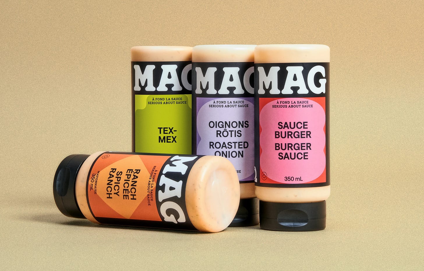
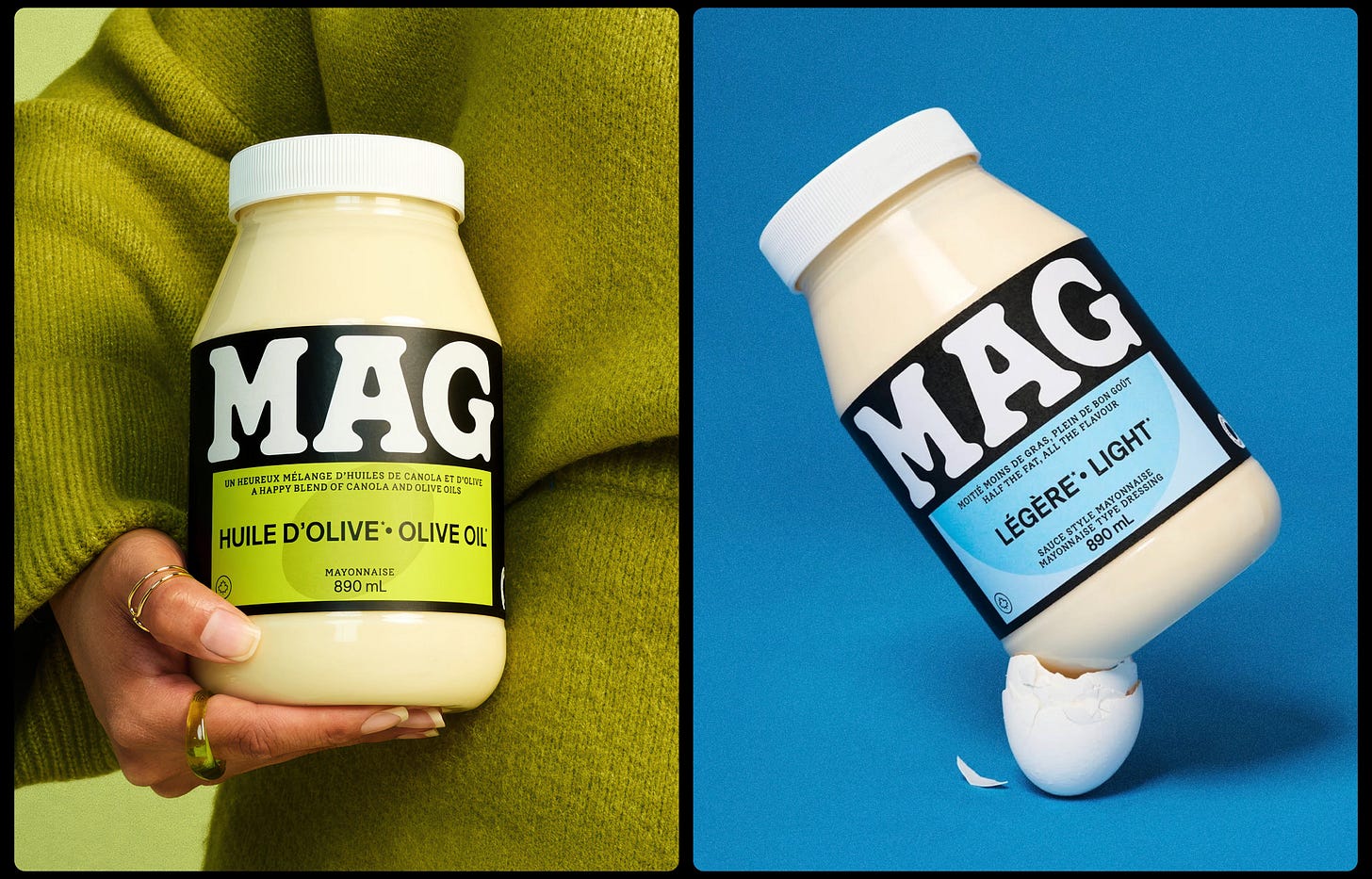
Based in Quebec, MAG is a family-run, family-recipe-based range of condiments anchored by its signature mayonnaise but also comprising dressings and Asian-inspired sauces. The brand made something of a splash earlier this year with its innovative solution to keeping mayo cold in situations like summer barbecues: creating labels using an ultra-thin layer of silica aerogel – an insulator developed by NASA for astronaut suits. It worked, as this fun image shows.
That futuristic solution to something of a quotidian but very real problem was dreamed up by creative agency LG2 – an independent creative agency with studios in Montreal, Toronto and Quebec City – which also rebranded the entire range last year.
If any part of the brief requested the agency to “make it bigger” when it came to the MAG name, there’s no doubt LG2 (Ashton, Toundra, Francos de Montréal) came up trumps – and not just for the sake of it.
The MAG wordmark is an absolute triumph, and deserves its gargantuan placement on packs (and indeed, wherever else across the identity it need appear).
It’s set in a sublimely gloopy, mayo-like all-caps, white lettering splatted against a black backdrop. The contrast is brilliant: not only is it striking in its Cooper Black-esque confidence, it perfectly reflects the product itself. And it makes the most of the succinct brand name, using the wordmark as a logo in itself, and luxuriating in the letterforms’ own curves and aesthetic nuances…
→ Continue Reading
Discover over 5000 logos from history, the largest archive of its kind online.
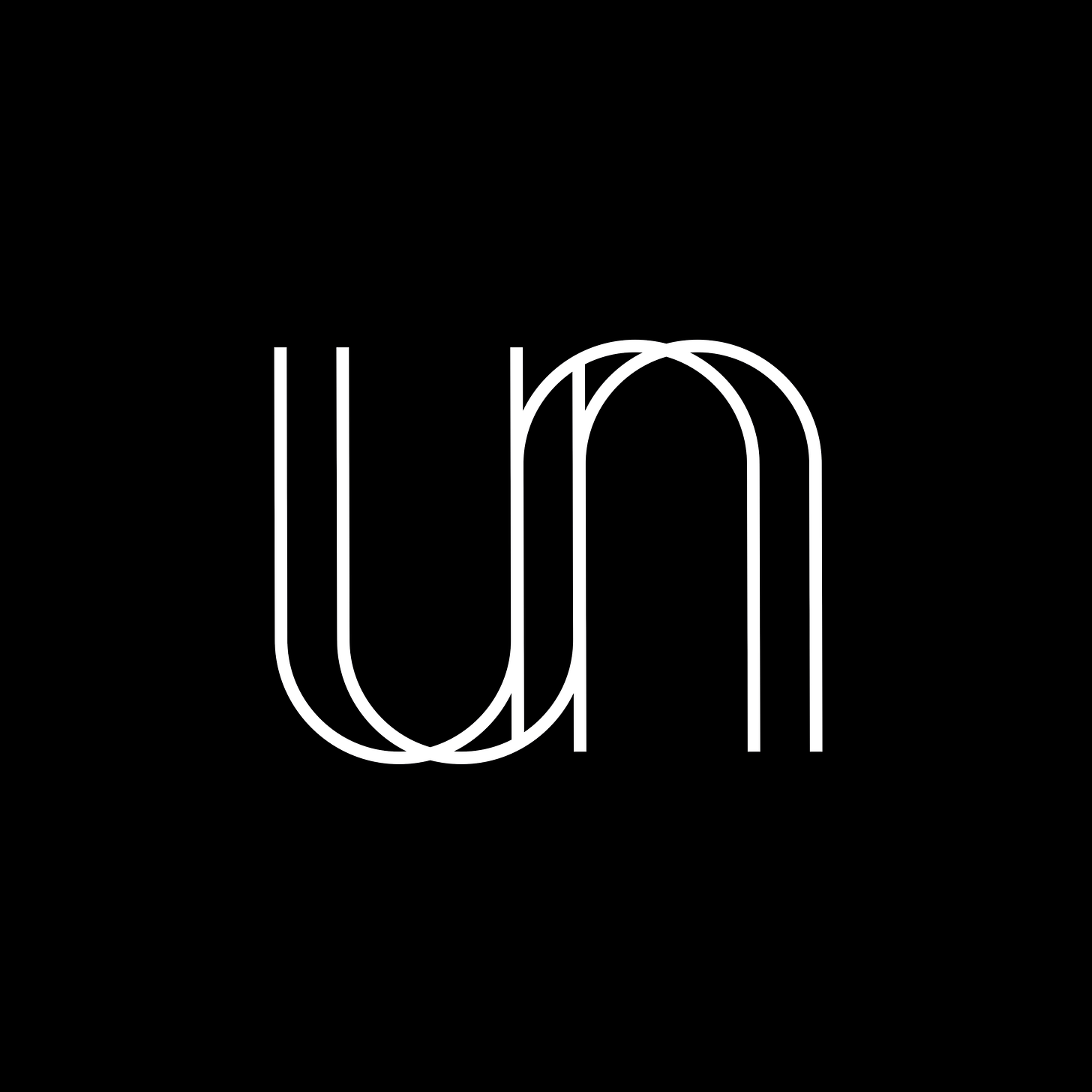
LogoArchive is the world’s largest online historical logo book with 5000+ examples, with more added every day for endless inspiration. Above, some of the recent logos added to the archive.
→ Join LogoArchive
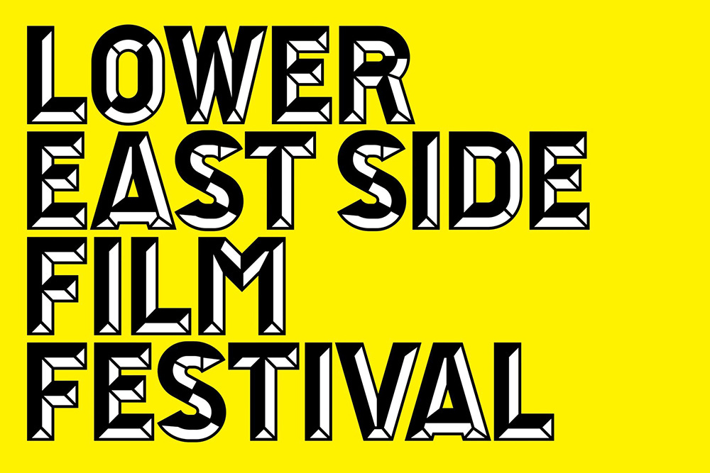
Brand Archive: Lower East Side Film Festival
Be inspired by the industry’s latest and best. Brand Archive has the logos, colours, typefaces and applications from some of the world’s best brands. It’s a resource like no other.
→ Visit Brand Archive
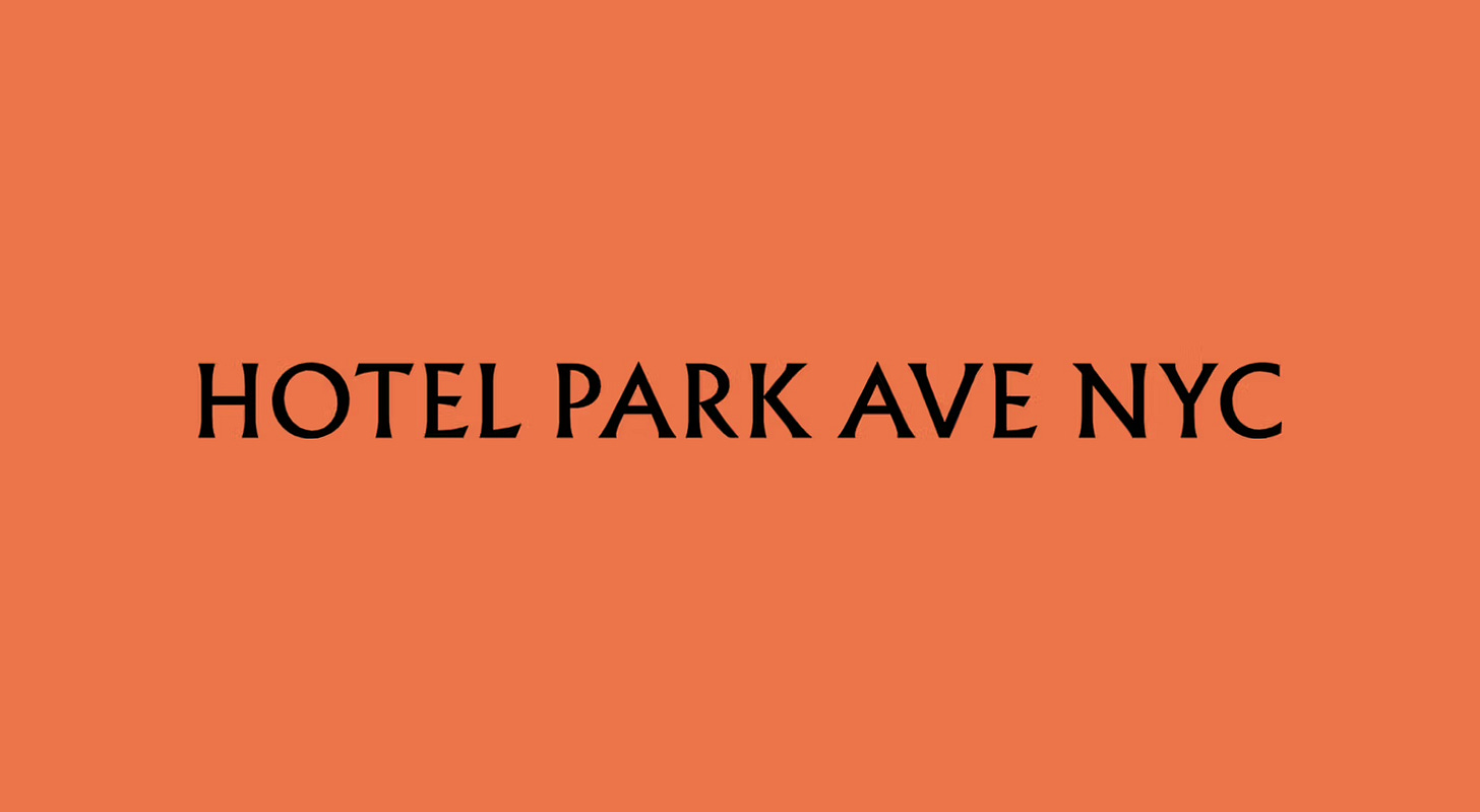
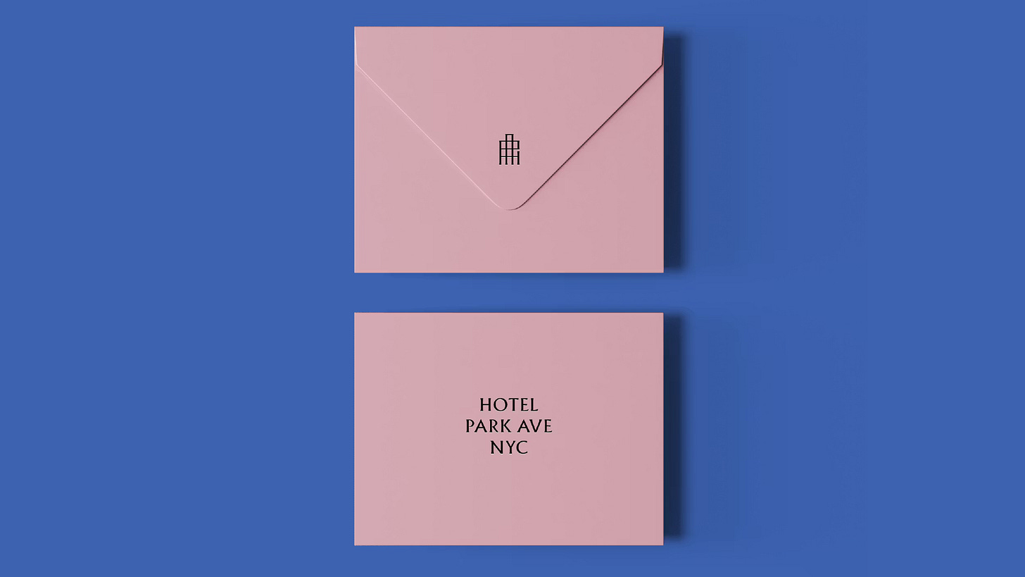
Hotel Park Ave
Opinion by Emily Gosling
Located on the corner of Park Avenue South and East 30th Street in Manhattan’s Midtown, Hotel Park Ave is the artist formerly known as the Mondrian Park Avenue.
Its change in name is thanks to its change in owner: international hospitality company Lore Group announced its acquisition of the site and mooted its subsequent rebrand late last year, and to helm the latter, it brought in London-based studio Colt.
Why a studio from across the pond, some might ask? Well, it’s likely because Lore Group, too, is headquartered in London; and just as likely because of Colt’s specialism in hospitality brands – and its track record of doing them really blummin’ well (see its work on Club at South Place Hotel, if proof were needed).
The Mondrian lineage – opulent, maximal, self-consciously decadent – carries with it a certain theatricality, but it’s clear Hotel Park Ave was looking to take a distinct approach to its predecessor in tone and temperament.
The rebrand reframes the former Mondrian Hotel for a new era, one shaped not by velvet-roped decadence but by a gentler kind of confidence: elegant individuality, and a distinctly design-driven approach to higher-end hospitality…
→ Continue Reading
Quick links:
Thank you for subscribing to Logo Histories. If you enjoy reading this short you may also enjoy these resources from the same team:
New! Portal – Design-driven jobs board, post a job for free.
Brand Archive – Research tool for brand designers.
LogoArchive Website – Searchable modernist logo archive & research tool.
LogoArchive Shop – Vintage design books & LogoArchive Zines.
BP&O – Contemporary design editorial.


