Matcha Mystery Matcha Mastery
This week, work by Base Design, plus the best historical logos added to LogoArchive.


Matcha Mystery Matcha Mastery
Opinion by Emily Gosling
If New York really is the city that never sleeps, that’s in no small part thanks to coffee – and now, increasingly, a newer entrant to the socially acceptable uppers scene, matcha.
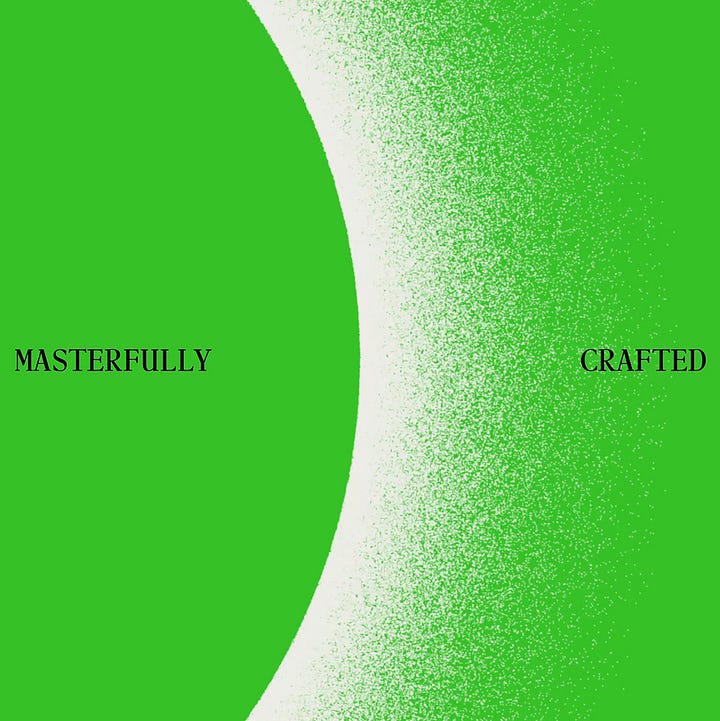
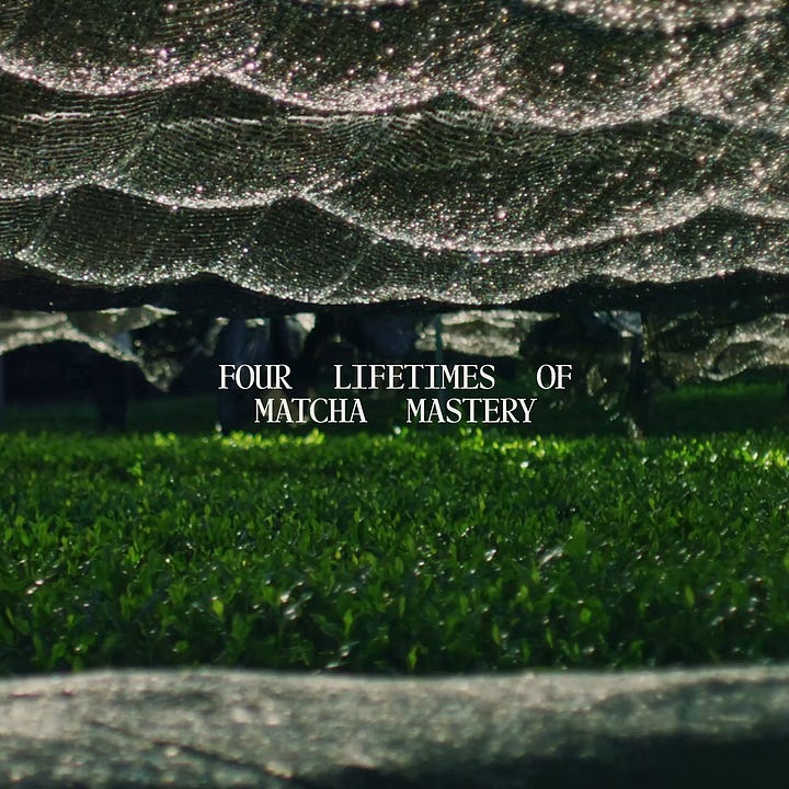
Capitalising on the growing interest in the sludgy green pick-me-up is 12, a new-ish matcha-centric café and retail store that opened last year in Manhattan’s NoHo area. Sited at 54 Bond St and founded by entrepreneur Alan Jiang, 12’s identity was taken on by Base Design (Hanbury, Devine Farmer, Murray’s Cheese) which worked across everything from its brand strategy to art direction, copywriting, digital strategy and design, naming, motion design, packaging, uniforms and merch.
At the heart of 12 is quality, simplicity and the sort of polished poise that so often goes hand in hand with those. Yes, matcha is heavily caffeinated, but here it becomes about contemporising but honouring tradition, artistry, and craftsmanship.
Sourcing from some of the finest tea harvesters in Uji, so we’re told, 12 worked closely with Japanese ‘tea master’ Haruhide Morita to perfect its blend, and other collaborators include award-winning chef Francisco Migoya and ‘flavour scientist’ Dr. Christopher Loss. The space itself was designed by Parisian architects Ciguë, while industrial designer Michael Young ‘redefined product innovation’.
The role of Base, then, was to create an identity that binds every sensory and material element into a coherent brand language and ‘elevate matcha with 360° mastery’. The agency says it didn’t just create the brand – it ‘helped assemble the ecosystem around it’, including aiding in the assemblage of the aforementioned ‘collective of masters’, ‘refining every layer of the experience to craft a brand unlike any other’.
Embracing both tradition and reinvention, much of the approach nods to the idea of ritual. This is demonstrated in the name, 12, a word so short that it’s a number – monosyllabic, enigmatic – 12 could be nodding to twelve hours, twelve months, twelve steps, or even 12Hz, the brainwave frequency linked with calm focus. It’s open to interpretation of course, but like everything else here, feels intentional.
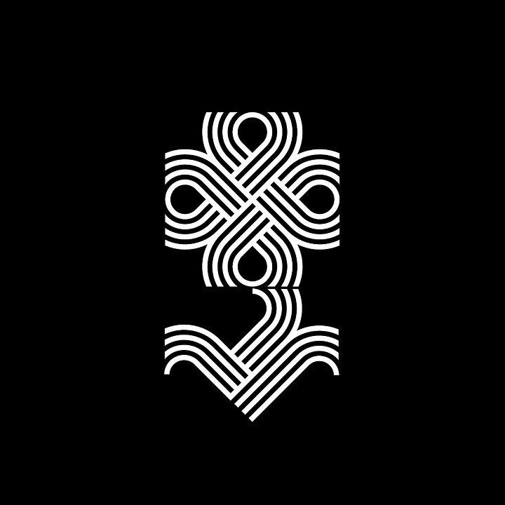
The logomark takes the form of a stylised, handwritten numeral that hovers between calligraphy and contemporary restraint, once again merging time-old tradition and modernity. This duality is echoed in the typography. Two typefaces are used in the brand that act as nice counterpoints to one another; both calm, legible, nothing too wild or shouty or jostling for attention…
→ Continue Reading


Discover 4700+ of the world’s best historical logos with LogoArchive.
LogoArchive is the world’s largest online historical logo book with 4600+ examples, with more added every day for endless inspiration. Above, some of the recent logos added to the archive.
→ Join LogoArchive
Brand Archive: Findest, 2025
Be inspired by the industry’s latest and best. Brand Archive has the logos, colours, typefaces and applications from some of the world’s best brands. It’s a resource like no other. New additions this week include Findest, Lyft, Tripadvisor, Flaum and Gemini.
→ Visit Brand Archive
Logo Histories: Swissair
Discover the story of the story of Karl Gerstner's 1978 logo for Swissair. Find this and over 150 other stories of logos from the past on Logo Histories.
→ Discover more
Quick links:
Thank you for subscribing to the BP&O Newsletter. If you enjoy reading this you may also enjoy these resources from the same team:
New! Wittl – Job posting and applicant tracking tool for design studios.
Brand Archive – Research tool for brand designers.
LogoArchive Website – Searchable modernist logo archive & research tool.
LogoArchive Shop – Vintage design books & LogoArchive Zines.
BP&O – Contemporary design editorial.


