Performus
Opinion by Daniel Milroy Maher
Branding a film production company is a delicate business. On the one hand, you need branding that can match and even enhance the quality of the films being produced, but on the other, you need something that doesn’t distract from the work or compete with it. Film is an intrinsically creative visual medium, and building a framework to support it means striking the right balance between respecting the filmmaker and their vision, and elevating their work through subtle yet engaging plays of colour, form and composition.
Sömestr Studio’s identity for creative production company Pomus does just that. Named after the Ancient Greek term for a fruit tree, the Istanbul-based studio specialises in live action and animated film, and prides itself on working with some of the best storytellers around. Founded in 2011, the team at Pomus has over a decade of experience in crafting engaging visual narratives, and even boasts a talented group of in-house animators who are known for their captivating stop-motion and mixed-media work…
→ Continue Reading
Home of historical logos online
Discover over 3000 historical logos added to the internet’s largest library. Carefully digitised, researched and uploaded everyday. Never run out of quality logo inspiration. Above, some of the latest additions. Update daily.
→ LogoArchive
Sound of Rowdy Dinner
Reviewed by Emily Gosling
We’ve covered no shortage of work by Pentagram in the past, most recently Cohere but spanning projects for London Fashion Week, NYC Parks, National History Museum and more. This is the first time, however, that we’ve looked at a project by new-ish New York office partner Andrea Trabucco-Campos and his team – and it’s safe to say, we’re impressed.
Graphic and type designer Trabucco-Campos joined the agency in September last year, having previously worked as creative director at Gretel and DesignStudio, as well as taking on stints at Pentagram as a designer and associate partner. His practice is heavily typography-focused (as is obvious in this new work), and over the last decade or so he’s worked with the likes of Rhode Island School of Design (RISD), Apple, The New York Times, and United Nations. His projects have included designing identities for theatres, film festivals, books, websites, and more; and creating a number of custom typefaces for publications and organisations.
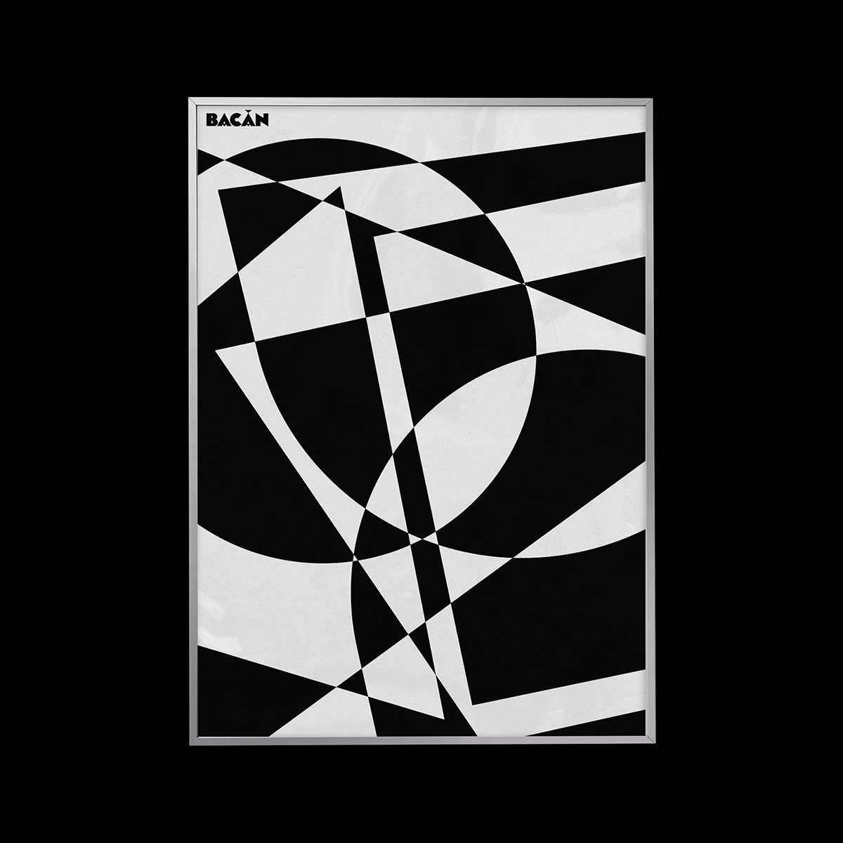
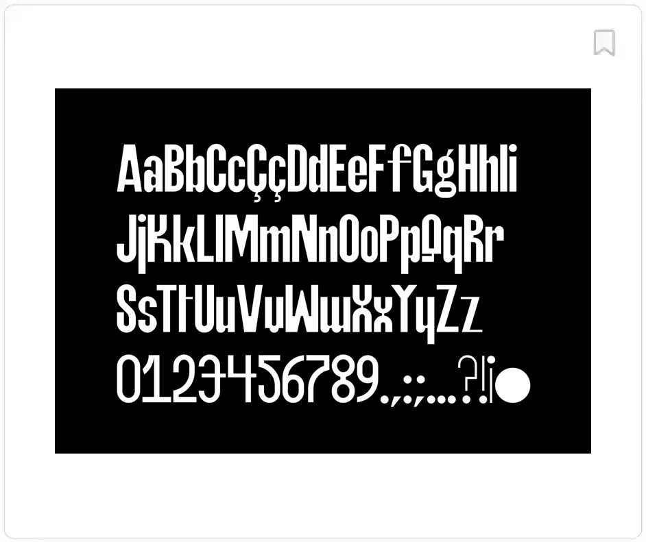
Here, however, we’re focusing on this recent identity for Bacàn, which seems to align perfectly with both Trabucco-Campos’ Columbian-Italian background and his typographic nous. Based in Williamsburg, Brooklyn, Italian restaurant Bacàn reopened earlier this year 'with renewed energy, culinary ideas and a restructured interior'; and Trabucco-Campos’ team was brought in to create a new brand identity spanning a bespoke typeface, signage, and environmental graphics…
→ Continue Reading
Build better brands.
Always be inspired and reference history’s greatest. From Saul Bass to Paul Rand, from Koto to Pentagram, Brand Archive has the logos, colours, typefaces and applications of some of the world’s best brands, from 1950 to present day. A resource like no other.
→ Visit Brand Archive
Polaroid – Logo Histories
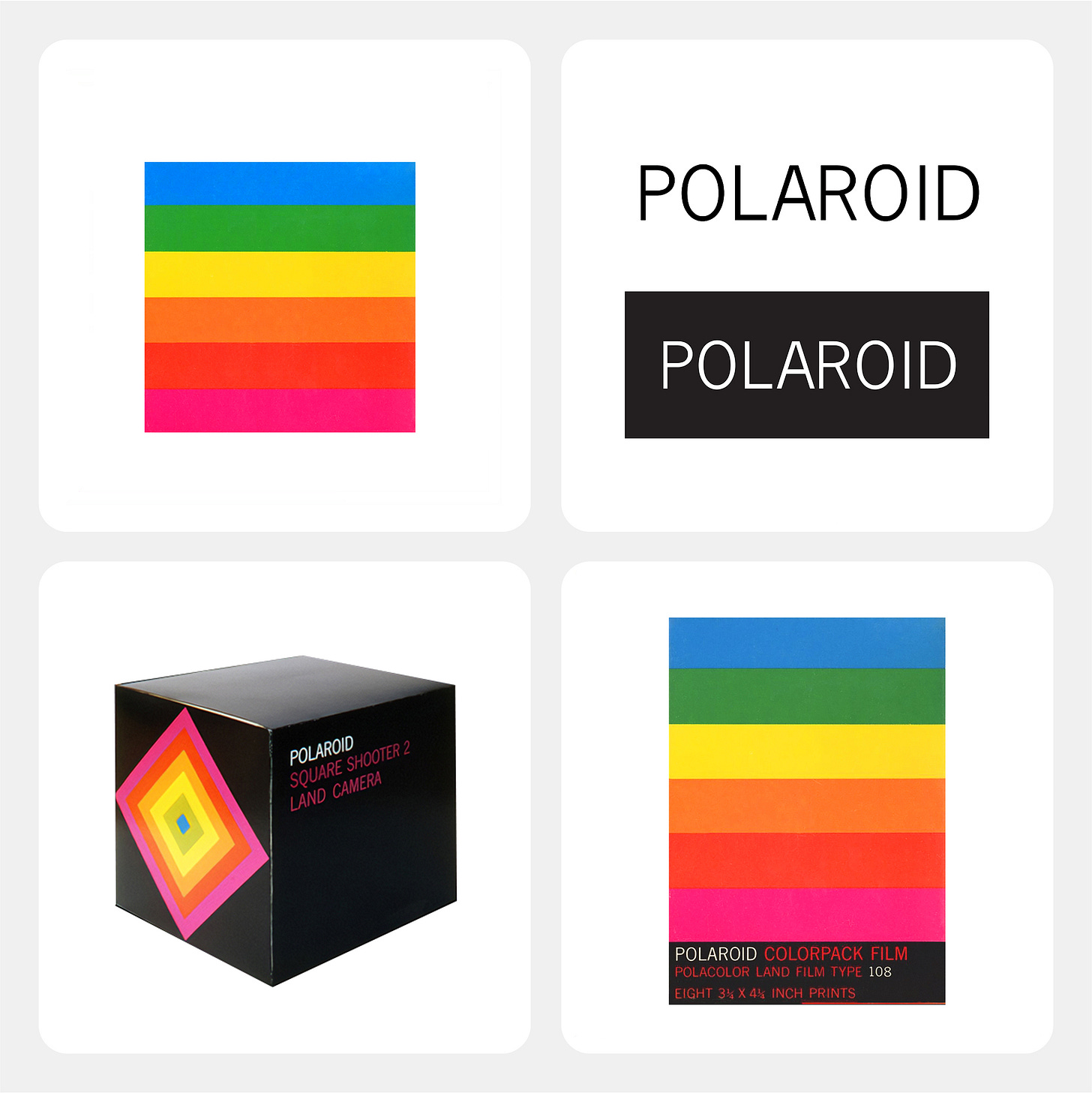
Logo Histories tells the fascinating story of Paul Giambarba’s logo and corporate identity for American technology corporation Polaroid.
→ Read
Thank you for subscribing to the BP&O Newsletter. If you’re interested in other design-related resources and tools, also check out these from the same team:
Brand Archive – Research tool for brand designers.
LogoArchive Website – Searchable modernist logo archive & research tool.
Logo Histories – Stories behind great historical logos.
LogoArchive Shop – Vintage design books & LogoArchive Zines.


